Upon clicking on the Philadelphia Inquirer homepage, I was overwhelmed. the CRAP principles talk about the contrast of the page. For this particular site, there isn’t much contrast. It’s pretty much black and white with a little pop of red. It talks about the contrast creating an interest to the page. For me personally when I click on this page I am not too interested. I do think the page shows repetition and keeps a consistent look so it doesn’t look to messy.
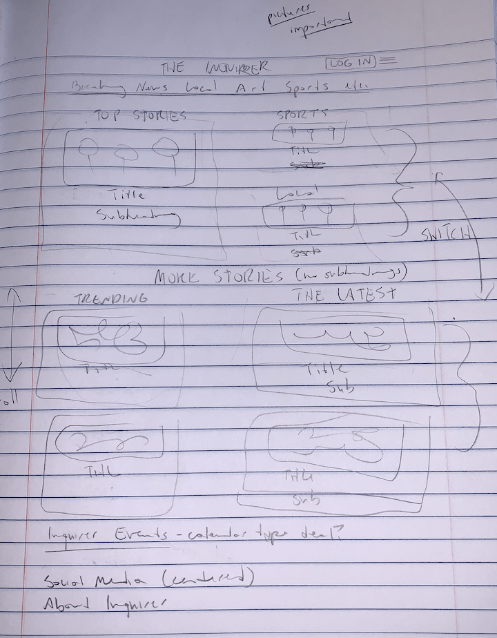
If I were to change the homepage I would add a little more color and visuals for sure. There is so much text it’s kinda overwhelming. Also some of the text is very small. By adding more images to the descriptions it gives the reader a more in depth view of the point they’re trying to get across. Or, it could make the reader want to click on that particular story.