Featured

Changing ESPN Logo:

As the Gestalt theory says, we look at a picture or object and we have reification, we associate what we see with a thought. When you look at the ESPN logo it’s easy. You recognize it right away and know what it is just because of the letters. I think ESPN is playing it way too safe. They are a multimillion dollar company and have a very basic logo with letters and no graphics.

They could really spice things up by adding a cool graphic. I think keeping their famous letters are a must. But, maybe add a picture that draws the viewer in more. Maybe someone who doesn’t know what ESPN means. So, they could look at the graphic and know the news organization is somewhat associated with sports. Some people don’t like sports, so they might have no idea what ESPN is just by looking at the letters. 
Review Social Graphic

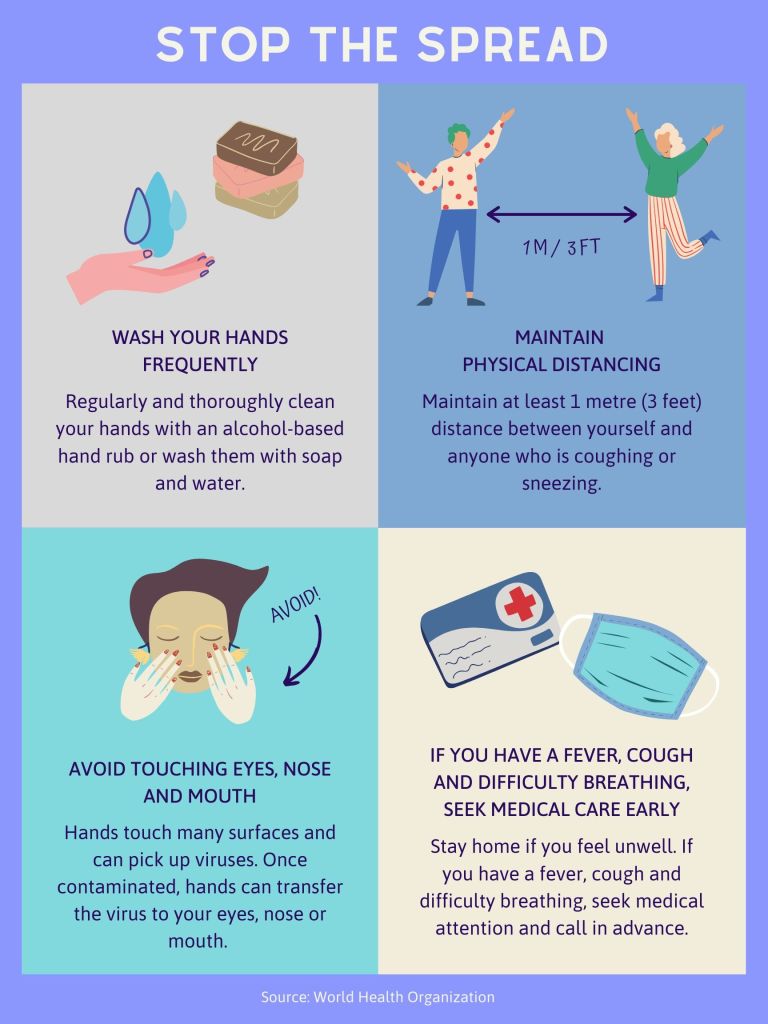
I really like the social graphic that I came up with. Although I know it’s more of an infographic. That’s the one thing I would change is maybe put less text and let the graphics speak for themselves since they are pretty self explanatory. But overall I’m happy with the graphics and text and overall mood of the project.

Website

Here is the link to my website: https://jjablonski605385713.wordpress.com/?page_id=36

I’m really happy with my logo! I think the color scheme and graphic really represents me. I did not get to complete the home page because I emailed you for help with it and didn’t get a response and I wanted to turn this in on time! But, if you click on the “blog” section it showcases my portfolio work. I also was able to edit the “contact” section with my contact information. The only part I had trouble with was editing the rest of the homepage. I was able to put a heading with my logo and some of my pictures but it wouldn’t let me edit any more. But, I’m really happy with it overall.

Corrections

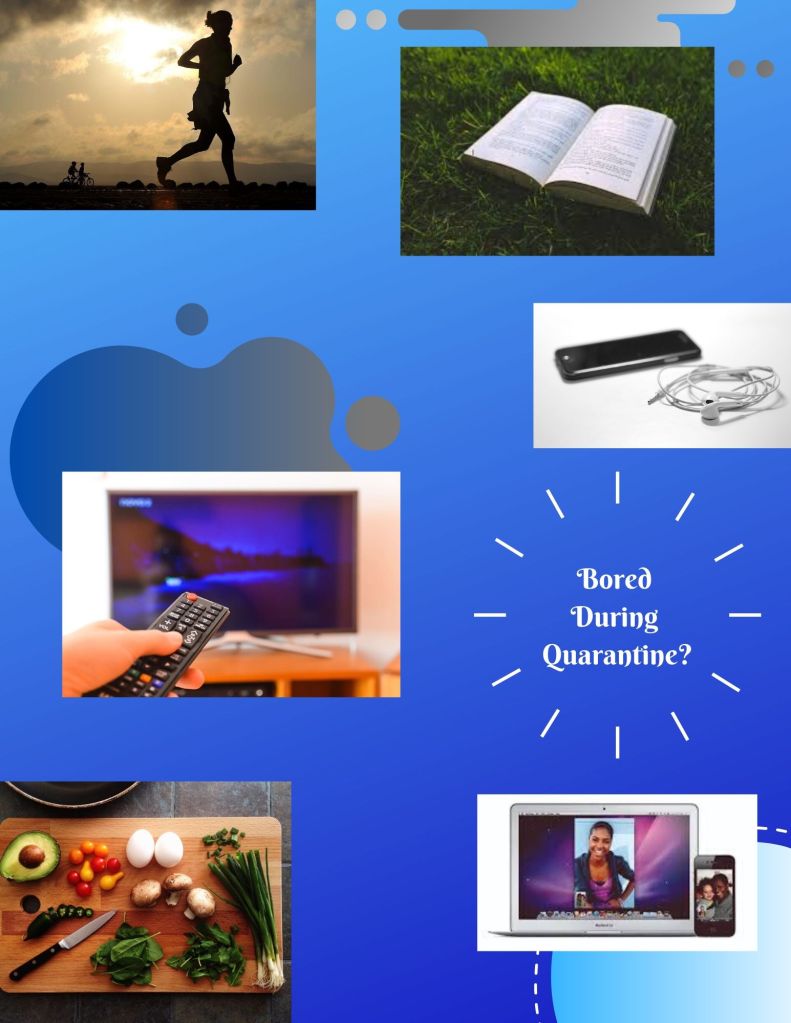
Things I would change about my Editorial piece is for one take more time on it. I rushed myself and didn’t put as much work into it as I could. I wanted to make the pictures all different shapes and didn’t get a chance too. I think I get my point across it’s just very simplistic and I could have put more effort and energy into it. I like the pictures and color scheme I used just as I said I wanted to make the pictures different shapes so they all don’t look square like.

Editorial

For my editorial I decided to do something that everyone could relate to right now. That is things you can do during the quarantine. I put things like reading, cooking, working out, etc. I chose a cool tone blue background with designs because blue is proven to be a calming color. I chose a simple font cause I wanted the main purpose to be the pictures.

Design a site like this with WordPress.com
Get started